
Getting the basics right when getting out there to shoot can save you a ton of headache in post-production. Sure, I am well aware that a lot of you who will read this post are much more advanced users, who have been producing lovely images for quote a few years, but there are a lot of people out there just starting out. For those of you, in this post we’ll get back to the basics.
Forget about the camera, tripod, or slider you are using. All that stuff is pretty much useless if you are not starting out with a solid starting point from the very first frame when you press record. More often than not, many of use are doing multi-cam jobs for very little money, often mixing DSLR and mirrorless footage from cameras from different manufacturers. It is not uncommon to see Sony A7sII footage, for example, mixed with more high-end models such as RED Epics/Weapons or F55s etc.
In cases where you need to do this a good colour chart is your best friend. A good colour chart with grey and skin tone references patches should always be a part of your kit bag in all cases no matter whether you are doing a one camera or a five camera shoot as it will give you consistent and accurate starting point for your grade later in post.
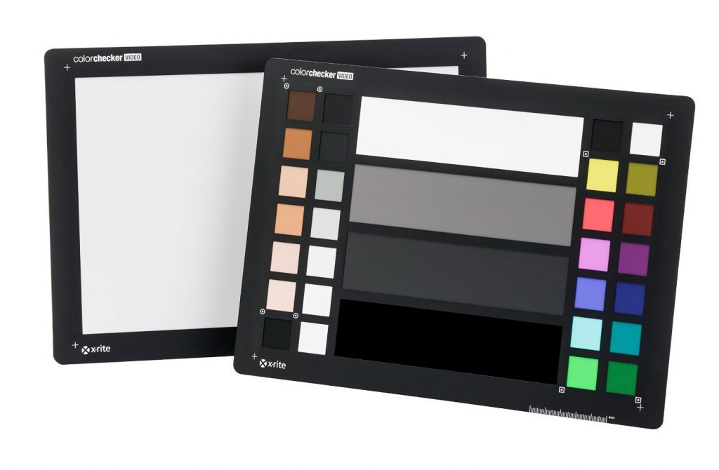
I own a few charts, but the one I find myself using every time is the X-rite ColorChecker Video. Now, for some of you starting out, you can grab one from Amazon US or B&H, and even though there are cheaper models out there, I wouldn’t recommend skimping on a reference chart.
Sure, there are more advanced and expensive models out there, but I find the ColorChecker Video to be a good size for packing in a backpack’s laptop compartment. Another more affordable alternative that I have been using for some time is the Datacolor SpyderCheckr 24. You can see a photo of the SpyderCheckr 24 below.
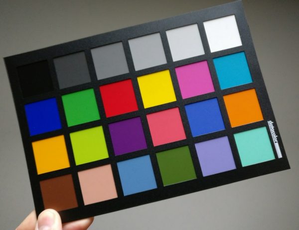

Datacolor SpyderCheckr 24 Back
The SpyderCheckr 24 from Datacolor is more compact, but it also more basic lacking the extra skin tone patches of the ColorChecker Video from X-Rite, which has 6 x patches instead of the 2 x skin patches on the Spyder.
In either case, I’d recommend both as decent colour charts for video. You can use both to set exposure and also properly white balance your camera in addition to giving your colourist/editor a good starting point for the grade by holding the chart next to your talent’s face at the beginning of each shot whenever the light temperature changes, especially in daylight exteriors.
Here’s a very nice video that was put together by X-Rite to demonstrate some of the main reasons behind using a colour chart for your productions.
Some of the reasons why use a Color Chart regardless of brand:
- Set proper white balance in camera
- Scientific, accurate colour reference for post-production and in-camera
- Match two or more cameras
- Get consistent footage from shoot to shoot
- Provide your colourist/editor with a decent starting point for grading
- Get the perfect exposure
X-Rite Coloratti Ollie Kenchington has prepared a very useful video below demonstrating how to use the X-Rite ColorChecker Video chart in popular NLEs such as Final Cut Pro X, Premiere and DaVinci Resolve.
What are some of your favourite charts? Which ones do you use on a daily basis? Let me know in the comments below.
Disclaimer: As an Amazon Associate partner and participant in B&H and Adorama Affiliate programmes, we earn a small comission from each purchase made through the affiliate links listed above at no additional cost to you.

